How To Create A Pivot Chart in Excel
Are you faced with a mountain of excel data, and need to consolidate it into a usable format so that it can be easily filtered grouped and sorted?
Welcome to the world of pivot tables!
Pivot Tables are part of most spreadsheet or business intelligence software packages. They can be used with any kind of data that is stored in columns, but are extremely useful when the data is so large that it goes beyond what normal spreadsheet filters can handle.
The pivot table, once setup can be used to group, sort, and summarize data using basic mathematical functions. The pivot or summary table can then be altered simply by dragging and dropping fields graphically.
Inherently we run across instances like this in our day to day jobs as planners or project control personnel when dealing with actuals from our timesheet or LEM system, summarizing data for invoicing or comparing data from our subcontractors to their invoices, etc. So let’s walk through how to do a simple pivot table in excel.
First we need a data source that is set up in columns. I am going to use an example data set that I found on the internet. This data is showing NFL Offensive Player stats from 1993 – 2013.

Once we have our data in the proper format, we can then make a pivot table. To do that, highlight the columns, and select the insert tab from the ribbon.

Once done you will see a screen as shown below.

This is showing the data that you identified, and asking if you would like to create a pivot table with the chosen data. Click OK. Next you will see a new sheet with a pivot table on the sheet and a pivot table field list on the right.

This is where the fun begins. Now we have to decide how we want to display our data. If you review the data that was supplied, it has columns that are descriptors for the particular row of data.
Namely (Year, Player, Age, Hometown, Home State, TM, and Position). Then the data has columns of stats or numbers. Let’s say we want to see amount of TDs by position. We would drag the TD field to the Values Window on the lower right side, and drag the Position field to the Row Labels position.

Looking at the TD field in the Values window, it is set to count. What this is doing is just counting the amount of entries that TD shows up in the dataset in the given position. What we need to do is change this to Sum, as one entry may be a value greater than 1.
So click the drop arrow on the right side of Count of TD and select “value field setting”

This window will pop-up:

Select Sum and press “OK” We end up with the following result.

From here we can chart our data. Select Options -> Pivot Chart, and then Select Column -> Column Chart, and press “OK”.

A chart is displayed showing amount of TDs by Position.

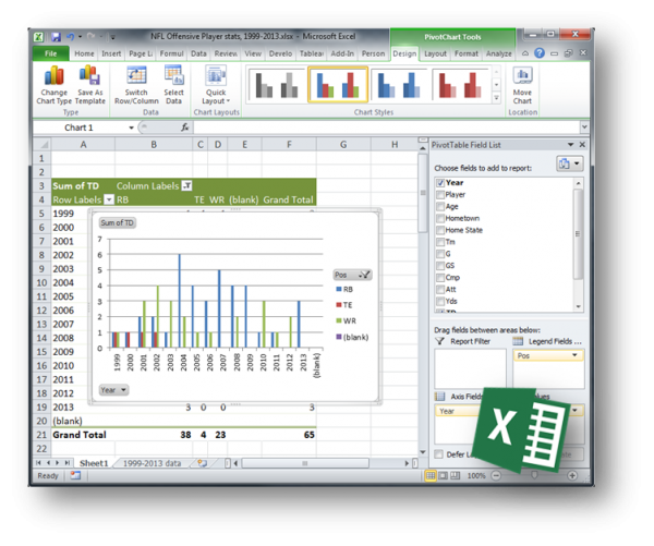
Maybe we want to break this down further. One way we could do that is plot this by year. So TDs by Position by year. Grab the Year field and drag it down to the Axis field window, and drag the Positions field to the Legend fields window.

Now we have the full chart, but wait, we can’t really see the other positions as the total numbers of TDs are so low compared to QB. Let’s filter out the QB so we can see the values for the other positions.
In the field list window scroll down to “POS” or position, select the drop down arrow.

Uncheck the QB item, and Press “OK”

Here is the final result.

Pretty handy right? Well now that you have a basic understanding of it, what if I told you, that you could use this same type of setup to chart resource units, costs, earned value, S-Curves, etc right out of P6? I bet you would jump all over that.
Learn more about Advanced P6 Reporting using Excel and check out the Free lesson video.