
In this blog, I’ll walk you through the process of setting up a Power BI dashboard with Primavera P6 data, focusing on creating a compelling cash flow visualization. If you’re managing projects with Primavera P6 and want to visualize your data in a sleek, insightful dashboard, Power BI is your go-to tool. By integrating Primavera P6 data into Power BI, you can create a planned cash flow and track progress with clarity. Let’s dive in!
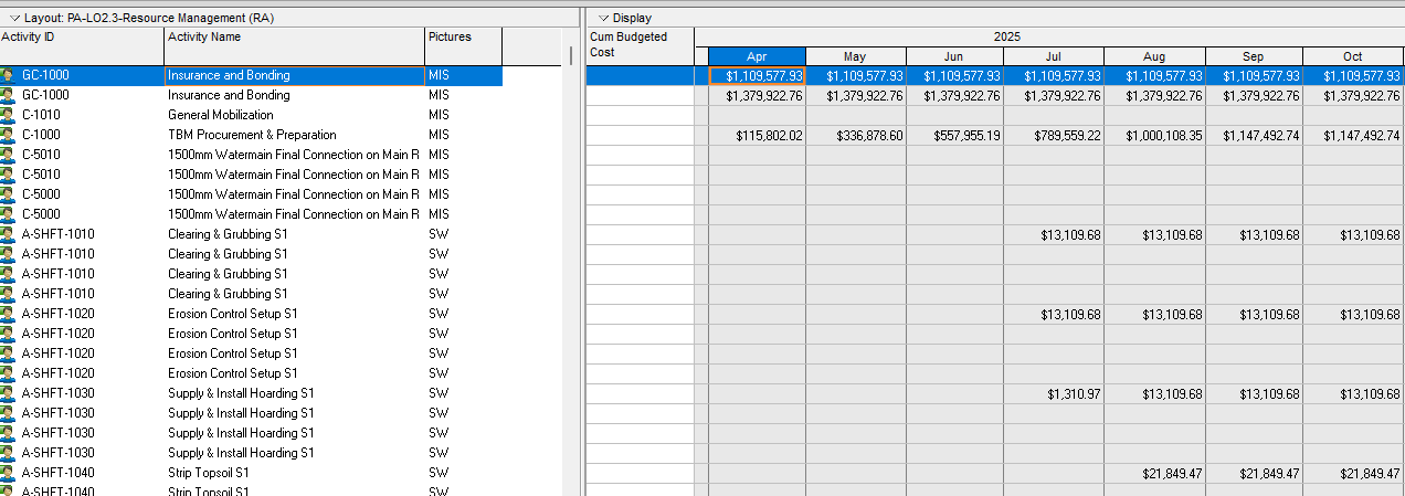
Step 1: Set Up Your Layout in Primavera P6
Start in Primavera P6 by configuring a layout that captures the essential data for your dashboard. Focus on key metrics like Cumulative Budgeted Cost, Budgeted Cost, Data Date, Baseline Program, and Actual Progress. These will form the backbone of your analysis. Ensure your layout is clean and includes only the relevant fields to avoid clutter in Power BI.
Pro Tip: Save this layout in Primavera P6 for consistency, especially if you’ll be pulling data regularly.
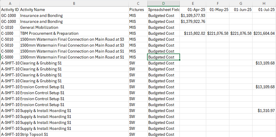
Step 2: Export Data to Excel
Once your layout is ready, export the data to Excel. Create separate sheets for each key metric: – Cumulative Budgeted Cost – Budgeted Cost – Data Date – Baseline Program – Actual Progress
This structure keeps your data organized and makes it easier to import into Power BI. Double-check that your data is complete and accurate before moving forward.
Step 3: Import Excel into Power BI
Open Power BI Desktop and import your Excel file. Go to Home > Get Data > Excel, then select your file and load the relevant sheets. Power BI’s intuitive interface makes this step a breeze, but ensure all sheets are correctly mapped.
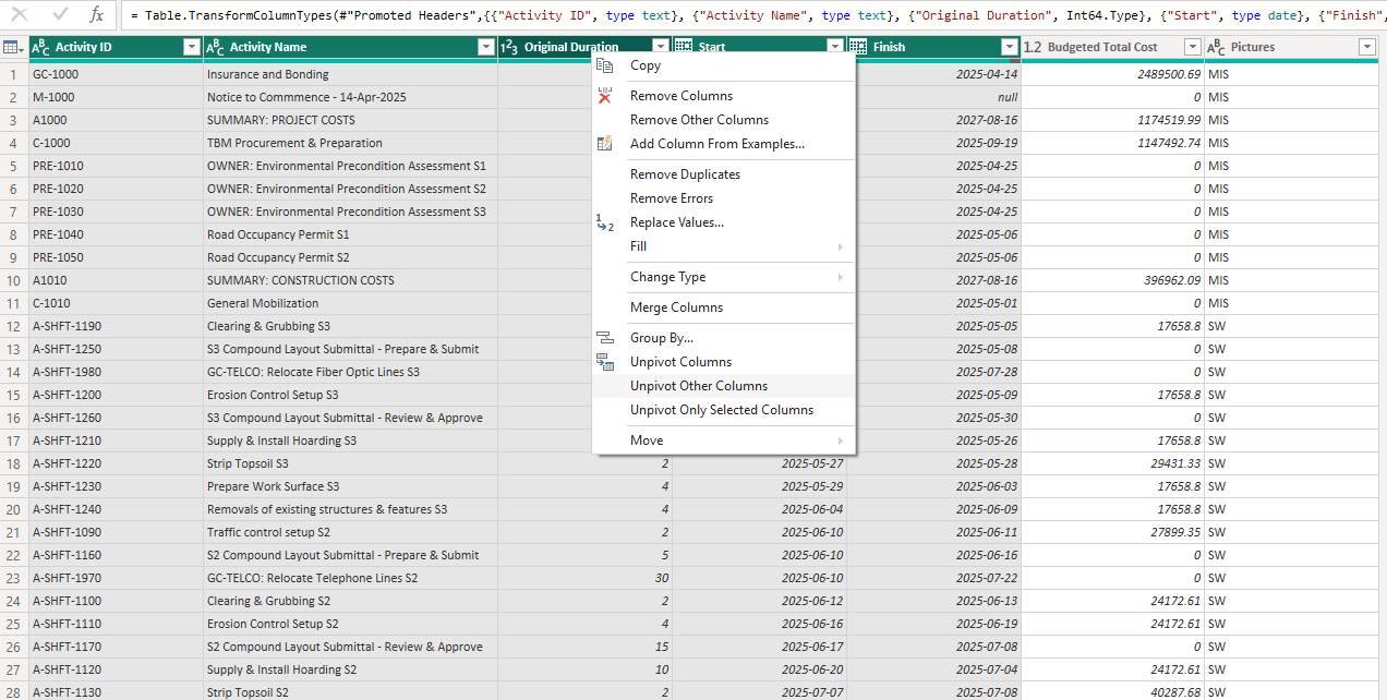
Step 4: Transform Your Data
Head to the Power Query Editor to clean and shape your data. A critical step here is to unpivot columns in the Budgeted Cost and Cumulative Budgeted Cost sheets. This transforms your data into a format suitable for analysis, converting wide tables into long, tidy datasets.
Next, format each column to ensure consistency: – Set appropriate data types (e.g., currency for costs, dates for Data Date). – Remove any unnecessary columns or rows. – Handle missing values or inconsistencies.
Once transformed, save your changes and load the data back into Power BI.
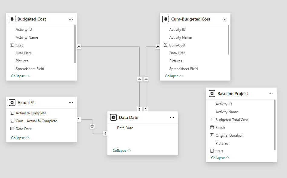
Step 5: Set Up Relationships in Model View
Switch to the Model View in Power BI and establish relationships between your tables. Link the Data Date column to its relevant sheets (e.g., Budgeted Cost and Cumulative Budgeted Cost). This ensures your visuals reflect accurate time-based relationships.
Pro Tip: Double-check your relationships to avoid errors in your visualizations.

Step 6: Format Columns in Table View
In the Table View, fine-tune your column formats. For example: – Format cost columns as currency. – Ensure date columns are in a consistent format (e.g., MM/YYYY). – Rename columns for clarity if needed.
This step ensures your data is presentation-ready.
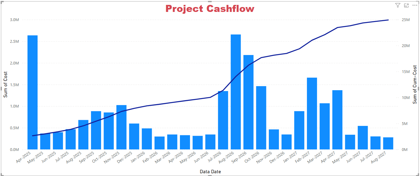
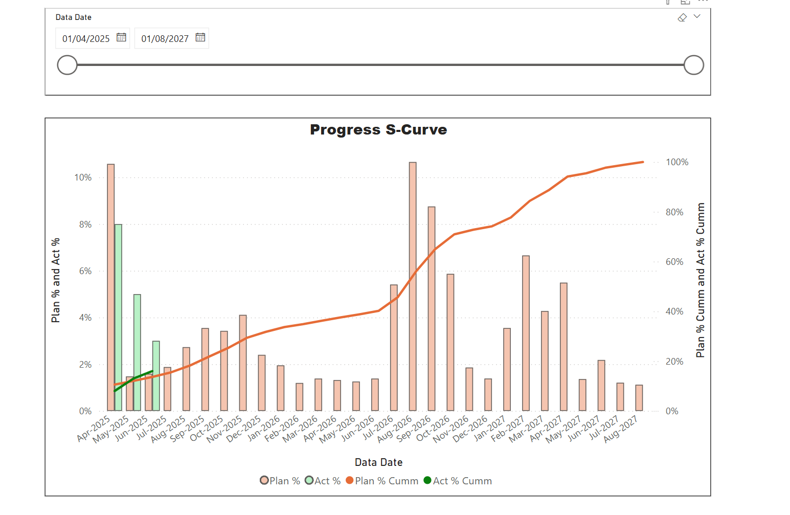
Step 7: Build Your Visualization in Report View
Now, let’s create the star of the show: a Line and Clustered Column Chart. In the Report View: 1. Add a new visual and select the Line and Clustered Column Chart. 2. Drag the Data Date column to the X-Axis. 3. Place Budgeted Cost in the Column Y-Axis. 4. Add Cumulative Budgeted Cost to the Line Y-Axis.
This setup gives you a clear view of your planned cash flow over time, with Budgeted Cost as columns and Cumulative Budgeted Cost as a line.
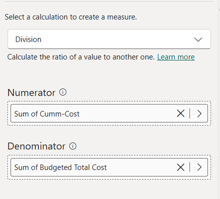
Step 8: Calculate Plan % Complete
To take your dashboard to the next level, create a Plan % Complete metric. Use Power BI’s Quick Measures feature to divide the Cumulative Budgeted Cost by the Budgeted Total Cost of the project. This gives you a percentage that reflects progress against the plan.
Replace the Cumulative Budgeted Cost line in your chart with Plan % Complete for a more intuitive view of progress.
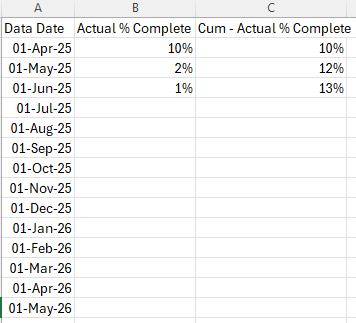
Step 9: Add Actual % Complete for Comparison
To compare planned versus actual progress, calculate Actual % Complete using a similar approach (e.g., dividing actual costs by total budgeted cost). Add this metric as another line on your chart. This comparison highlights variances and keeps your project tracking on point.
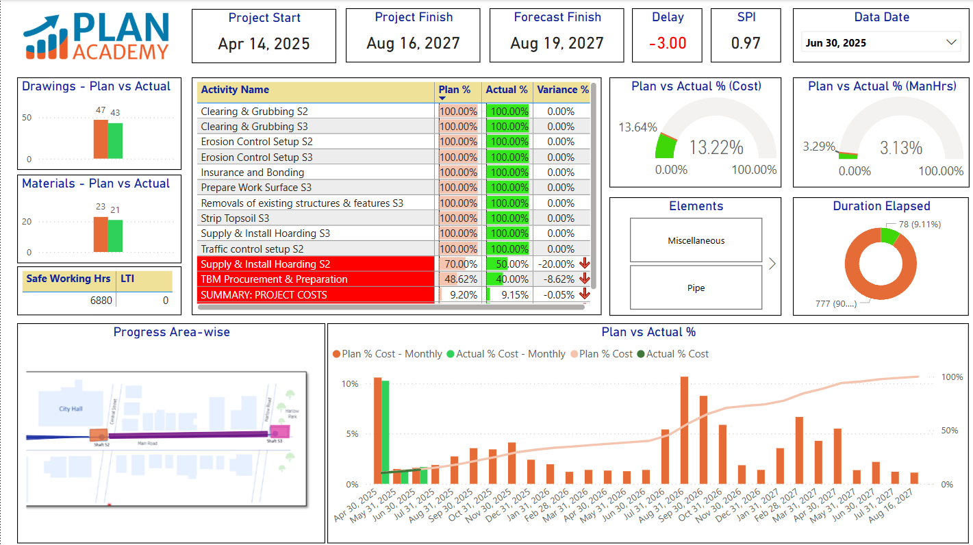
Step 10: Polish and Share
Tweak your chart’s formatting—add titles, adjust colors, and ensure readability. Save your Power BI file and share it with your team via Power BI Service or export it as a report. Your dynamic dashboard is now ready to impress stakeholders!
Why This Matters
This dashboard isn’t just a pretty visual—it’s a powerful tool for project managers. By integrating Primavera P6 with Power BI, you can monitor cash flow, track progress, and spot issues early. Plus, the flexibility of Power BI lets you customize further as your project evolves.
Try it out, and let me know how it transforms your project management game! Got questions? Drop them in the comments below.
Sample Dashboards
Disclaimer: This tutorial is not part of our Power BI Foundations for Project Controls online course. It’s supplementary to its lessons.