
A great way to see all your resource assignment levels comparatively over time is to use a Stacked Histogram in Primavera P6. It’s a feature that is available in the Resource Usage Profile charting facility.
The process to get this all working is a bit convoluted, so we’re going to show you step-by-step the process.
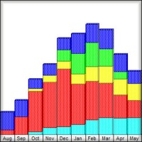
Stacked Histograms are common sight in project environments. Primavera P6’s stacked histogram stacks each bar on top of each other to give you a full view of your resourcing over time. The stacked histogram can graph either At Completion Units or At Completion Cost.
The stacked histogram offers the following advantages over Primavera’s standard Resource Usage Profile graph:
- provides a richer information than the standard resource profiles
- shows how each resource / resource grouping contribute to the overall labor in a given time period
- shows relative proportions for each resource / resource grouping
- allows you to view and analyze resource trends
- color coding can be used to highlight a resource or grouping
The histogram has some options to help you tweak it. From the options screen shown here, you can add a cumulative curve (S-curve) overlay if you like. Note that you can also use the arrow buttons to adjust the order of the filters to set them just right.
Stacked Histgram in Primavera P6 Video
Watch the video below to be walked through the step-by-step process of building a stacked histogram in Primavera P6.
Hi everyone, it is Michael. Today we are going to show you how to create beautiful pictures in Primavera. We are going to show you how to create beautiful pictures that look like this.
This is what we call the stacked histogram in Primavera P6. It is part of the resource research profile. Today will do a quick walk through to show you how to keep this happening in your Primavera P6. Ready? Here we go.
Today we are working with the Juniper Nursing Home Project. We want to get the resource histogram working for us. Resource histogram is a really nice view that lets you stack your resourcing on top of each other. It is often submitted as report and what not. It gives you a really nice analysis and can help you see what types of resources are being used and to what points in the project.
To do this we are going to work on the Resource Usage Profile Screen. Many of you are probably are already familiar with this. To get things moving in the right direction, on the left hand side, I am displaying all the resources. I would like to filter that by just the current project’s resources. You can see there is quite a long list on the Juniper Nursing Home Project. Lots of different trades and some management folks in there.
Now that we filtered on current project’s resources, we want to set up our stacked histogram. To do that we will click this right display bar and we will choose Stacked Histogram. Notice I do not have show all projects. I want to keep my resource display within the scope of just the project I have opened. Make sure that is unchecked and we will check Stacked Histogram.
At first, it does not look very glamorous. I have an empty screen on the left hand side and no bars. There has quite been a set up that needs to happen. It is not difficult set up but it involves quite a bit of clicking.
The step is essentially to create filters to filter different resources. Let us see how that works. Once again, we will click this display bar. We will go down to Resource Usage Profile Options.
If you are familiar with this screen when you have the Stacked Histogram setting on, you will notice it looks a little different. I have filtering area down here. Looks different than what we are used to seeing. What we need to do is set up the filters that I have discussed. Here is how those filters work.
We will first outline. I get my familiar filter box come up. In the dropdown, the typical Stacked Histogram would filter on the different resources that we have. You can see that there is also different ways to filter from everything from calendar, to max units, to overtime and to shifts.
In any of those could work for you. You may create a really unique Stacked Histogram, perhaps based on shifts if you want or even based on calendar and what not. We are going to keep things simple in this tutorial. We are going to do it based on resource I.D.
Selecting resource I.D., we will now go over here to the value area and we are going to get our familiar little button. If this is not filtered, you want to filter this by the current project’s resources and then sort them alphabetically. It will make your life a lot easier.
Essentially the first filter that we are going to build will be for the first resource I want on my histogram, the Concrete Sub. Select them and then call this Concrete Sub.
This name here that we put in the filter will show up on the left hand side. It tends to be part of the labelling. You want to put a nice descriptive name in there. It can show up on printouts. Go ahead and click OK. Just so you can see how things are progressing we will click Apply. Concrete Sub shows up and here is the histogram for the Concrete Sub.
Now let us start stacking different resources on there. Click add again, and then again go down choose resource I.D. This time we will put in our Conveying Sub.
Click OK, again give you the Apply so you can see how it progresses. Will do the third one, adding my Dry Wall, do it one more, we will add in our electricians and we will click Apply. Click in OK. You can start to see how we build out that histogram.
Unfortunately, if you want to display every resource, you do need to go in add the filter for each resource. Something I find really tedious. I have been searching for easier or kind of shortcut ways. Any way we can stream line this process but I have come up with no ideas. It is simply seems to be a matter of going in here and adding the filter for each resource that you want on there.
Now some common questions are how many can I put on there? I have not been able to hit a limit. You can add in as many of this filter as you like and you will continue to stack and stack and stack. Now it is time for you to show off. Get in the Primavera and start creating some stacked histograms. Show them off to your boss and colleagues.
Thanks for checking out the tutorial.
Dear Sir,
May I ask you about this stacked histogram if I can show both early & late remaining units on it.
and also I need to know what is the stacked histogram shows by default (Budgeted/Actual/…) ??!
Thank you.
Hi Boules,
Unfortunately, no. The stacked histogram in P6 doesn’t have that option.
Michael
Hi Michael,
I’m getting cumulative histogram for the actual up to DD, and after the histogram is OK. How to get rid of the cumulative
Right-click in the graph and go into the Options. Uncheck any bars in the Cummulative column. Click Ok.
I have the same problem where all the historical actuals are pushed into week 1 of the look ahead
Dear Michael,
In the project i done i can see normal resources histogram but can’t see the resources in stacked histogram, where did i do wrong? Is it because of not scheduling the project ?
I am having some difficulties with my stacked histogram: some resources are piled up on the 1st day (which is my data date); I cannot spread the resources even when my dates are okay. My Y-axis is not representative of my resource spread expectation. Could you please help?
Sure thing. Goto Edit->User Preferences->Resource Analysis tab. On that tab, look for a field called “Interval for time-distributed resource calculations”. Set it to Hour. You may see some slowdown in the software, but the data will be correct.
I am having trouble with the stacked histogram. I have coded my activities both with Codes and Names. When I execute either way the Stacking is not correct nor is the Resource name listed in the histogram. I can get a histogram for each resource but not a stacked showing both
need help pls…
i followed all the guidelines on building stacked histogram, however the result is very much different from the tutorial. my histogram showed only one resources while i loaded all labor resources (using resources ID on filter).
say, only mason is on histogram, while electrician, tile fixer, carpenter so on are not reflected on histogram.
anything to add pls
tyvm
It might be that they are off the screen. Scroll over to the right or use the magnifying buttons on the toolbar to adjust your timescale.
thank you very much for reply…
i tried scrolling and zooming out, changing timescale..
still, i cant see other resources on stacked histogram, ( i have 11 resources, only 2 are showing on stacked histogram)
Did you try scrolling left and right?
Hi Michael,
Thank you for this tutorial. I am trying to find a way to reflect overtime in the resource profiles – is there a way of identifying which activities are overtime specific so this shows as a separate colour and so it is easy to see that they are not ‘overallocated’ as such?
To identify overallocations in P6, you really have to go digging resource by resource and look at their Resource Usage graphs. When you see red, usually that’s an overallocation to correct.
Hi.How could I show total pax instead of total hours in stack histogram
Sorry – what is total PAX?
Hi Michael,
I have created a stacked histogram. But problem with that one is all Mondays in the first 8 weeks are ridiculously overloaded. I don’t know why this is happening. I have double checked the data i entered and it is correct. For example, manhours on Mondays are almost 3 times the Tuesdays or Wednesday or any other day for the matter of fact.
I was wondering if you happen t know why this is happening.
If you do, would you please mind sharing?
Thanks,
Best regards,
Sushil Chaudhari
Try this. Goto Edit->User Prefs -> Resource Analysis tab. In the “Time Distributed Data” section, make sure you have “Remaining Early Dates” selected. But more importantly, change the interval to Day or also try Hour.
P6 tries to be efficient in what is shown on screen by lumping data at the beginning of the week or month. But you can tell P6 to ignore being efficient and to be accurate instead with this setting.
Hi Michael,
When i have a stacked histogram, and my timeline is set to week/day. Now i can see a stacked column for each day. How would i see the activities related to that particular day.
Would you please help.
Thanks,
Best Regards,
Sushil Chaudhari
The options to see the individual activities are not available when looking at a Stack Histogram. If you revert the graph to a the regular view (not stacked histogram), you’ll see filter check boxes on the bottom left-hand side of the screen. (also make sure on the graph menu that “All Projects” is unchecked). Then you can use the “Time Period” check box to turn on a filter that will display only the activities that you want to see – click on a period in the graph to see activities for that period.
hi Sir, question. Ive try the step Resource usage profile option. When i add resource filter, and click on value to select resources, no resources info display. Why is it become that way? Did i miss any step during preparing planning?
DEAR
I AM FACING PROBLEM THAT AFTER PREPARED THE STACKED HISTOGRAM ,THE PROBLEM IS THAT I LOST THE WHOLE STACKED HISTOGRAM & RESOURCE WHICH WAS LOADED IN THE SCHEDULE.
PLEASE ADVISE.
M. Iqbal Ali Khan
Have you tried turning off the Stacked Histogram check box on the right-hand display bar?
Hi everyone I got correct Histogram of my resources but Histogram is not showing limits or maximum unit per time if limit is not in graph then how can I track allocation
Just right-click in the graph, go into the options and check those limits on.
I seem to have maxed out at 50 using P6 Professional 16.2. I would be interested to know if anyone else has reached a different maximum or if there is another way to display stacked profile for that many.
Hmmm that’s the first time I hear there was a limit.
Hi Sir, My stacked histogram is perfect but I need to print directly from the P6 but unfortunately the resource name does not appear. How do I make sure that the resource names appear on the printed histogram page
I think you can customize the header / footer to add the name there.
How do u get rid of P6 cumulating labor units in the current month? The rest of my histogram is good. Also is there a way to adjust the x axis unit scale down to avoid a large white upper half of the histogram?
Sorry there isn’t a way to adjust the axes. Sometimes they show very poorly. The best thing to do it export the data to Excel to build the graphs in Excel where you have more control.
Hi, is there a way in P6 pro client to which I can view my resource load across many projects with out having them open? We have too many projects to which our system crashes if we try to open all at once.
Hi John,
We just posted a new ‘Ask Plan Academy’ video to our Youtube Channel in response to your question.
Check it out here:
https://www.youtube.com/watch?v=MQ0u70xEGYE
John I have a video coming on how to solve this one. Tomorrow.