
Comparing two Primavera P6 schedules is one of the most fundamental things that we should be able to as a savvy scheduler. If you’ve ever wanted to know what happened between Month 3 update schedule and Month 4, then this article is for you.
Which are the best tools for comparing Primavera P6 schedules?
I’m going to go review and test out 4 P6 schedule comparison tools, in depth, to help you make the right decision.
How important is it to be able to compare 2 P6 schedules? Well, let’s discuss.
Perhaps you work for an Owner and the Contractor is submitting schedules to you; you will want to verify what the differences are between schedules to ensure the contractor is following the specification. You will want to be able to dig out those schedule differences.
Maybe you’re performing delay claims analysis; you’ll need a tool that’s going to help you walk through any sort of forensic schedule methodology where you’re comparing 2 schedules to figure out who’s at fault or who gets a claim.
I will also talk about the affordability of each of these products. But first a quick disclaimer – Plan Academy is a partner of one of the tools that we’re going to highlight. However, I’m doing my best to give an unbiased view of all the tools. Some of these tools I’ve been talking and writing about on my blog and even using with them.
Tool #1 : Primavera P6’s Schedule Comparison Tool (formerly Claim Digger)
Oracle Primavera P6 does have its own built-in Schedule Comparison tool, which used to be called Claim Digger. You can access it from P6’s Tools menu and look for Schedule Comparison.
When you run the schedule comparison, you’ll see that it comes up inside P6 Visualizer.
P6’s Schedule Comparison is pretty basic and does what it says it will do; it does compare schedule A to schedule B on a field by field basis.
When you run it, you get an incredibly long output all formatted in HTML tables. While there are other output options, if you opt to get it into Excel, the situation isn’t any better. All the data is in one huge table. The data is incredibly hard to work with, it’s even very difficult to find exactly what I’m comparing in each section. There’s no highlighting, no colors, or indicators. It is data dumped into a file making it very difficult to use.
The data is very complete however, it covers different areas pretty well.
Where does the P6 Schedule Comparison tool fall short?
While costs are supported in the tool, which is something I really like, one gripe I have with this tool is that when there is no previous value, it just says Value Not Specified in the database. And in some areas, you’ll see that written over and over.
So not a lot of thought has been put into how to handle this data at the end. For example, if you wanted to take that data and put it into a report, you probably must erase that field and reformat it. One of the things I don’t like as well is if you compare WBS code, it basically just regurgitates the entire project.
I also had trouble getting the data into Excel using the CSV file. A lot of my data in P6 has commas in it, and those commas screwed up the import to Excel.

Primavera P6 Schedule Comparison: Pros & Cons
Schedule Comparison is built right-in with your Primavera P6 software; you don’t have to pay for any additional tools for it to work. Lots of fields are covered, so the comparisons are very thorough and that’s great, including cost comparisons.
On the con side, the tool’s output is incredibly difficult to use. I find it very challenging. You’re going to spend a lot of time formatting output and making changes to make it usable.
It is also missing a couple key fields that I would like to see. I don’t see any change in Lags reported. I also don’t see Data Date reported anywhere which is a very key field. In addition, many users have reported problems getting Visualizer to run. If Visualizer doesn’t run and there are technical problems for some getting it to run, then this feature will not work for you either.
Lastly, I did see some inconsistent data. For example, I tested putting Expenses on activities. However, they were reported as Project Expenses, not Activity Expenses and I’m not sure why.
PRO’s
- Included with Primavera P6
- Compares lots of Fields
- Includes Costs
CON’s
- Output is incredibly difficult to use
- Some key fields missing
- Problems reported running Visualizer
COST RATING: Free.
In summary, if you don’t have budget for a improved tool, the Primavera P6 Schedule Comparison tool certainly will work for you, but be prepared to wrangle the data into a useable format.
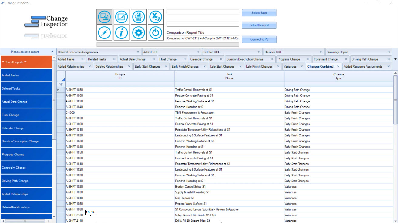
TOOL #2: Change Inspector
If comparing P6 files is kind of your bread and butter, you probably want to invest in something better than the P6 Schedule Comparison tool. The next tool is Change Inspector. Change Inspector is a tool that I’ve written about quite a few times. What I love about it is it was designed exactly for this purpose – schedule comparison.
With this tool you can either choose and load the XER files or even connect directly to an SQLite database.
A couple of things that I really like about Change Inspector are that it gives you a Summary Report. The summary report lets you know all the different aspects of your project that has changed at a high level. And then you can dig deeper into what’s different by going to see your Early Start tab and seeing the differences. Not only that, there’s also a Changes Combined area which lists all the different changes.
The output to Excel is incredibly good as well in Change Inspector. To look at the output to Excel, you can click Excel icon. I like that the Excel output is broken into different tabs. It makes it so easy.
Another feature I like is the Scheduled Dashboard. It highlights the high-level things that are different. For example, number of Complete Activities in the base, the number of Negative Float Activities, etc. Included are some graphics that let you see what is going on.
What’s Missing?
A couple of things that are missing for me in this tool is a change in the criticality of activities. When has an activity been critical and now is no longer critical or became critical? That’s missing as well as it would be nice to have support for cost where we can compare our actual cost, total costs between all those different fields.
Since change inspector imports our files, it would also be nice to see support for XML files as now, in my opinion, we’re starting to use XML files a little bit more these days.
Change Inspector: Pro’s & Con’s
PRO’s
- Connects to a P6 database: Oracle, SQLite
- Easy Excel-based Output
- Change Summaries + Dashboards
- Lags, Driving Path, Variances supported
CON’s
- No support for Cost comparison
- No changes to Criticality or Critical Path
COST RATING: $
In summary, yes I really like Change Inspector. It’s very simple and makes it very easy to do schedule comparisons. The output in Excel is excellent and easy to use. It makes digging into schedule differences the focus.
TOOL #3: XER Schedule Toolkit
What is XER Schedule Toolkit? It’s an online tool that does a whole bunch of things; it’s a viewer, it does analysis & dashboards, and has a bunch of features geared to project controllers, one of which is schedule comparison.
Let’s talk about the schedule comparison feature; I’m just going to focus on that.
Once you get to the schedule comparison area, you can see at a glance what’s different between your 2 projects – and this is where XER Schedule Toolkit has done things a little bit differently. The interface is unique.
You can even go down to the WBS or task-level logic. And this again is where I feel like they’ve separated themselves a bit. For example, if I want to see which WBS areas have new Finish Dates, I can do go to “Select Finish” and kind of expand the results and see the differences.
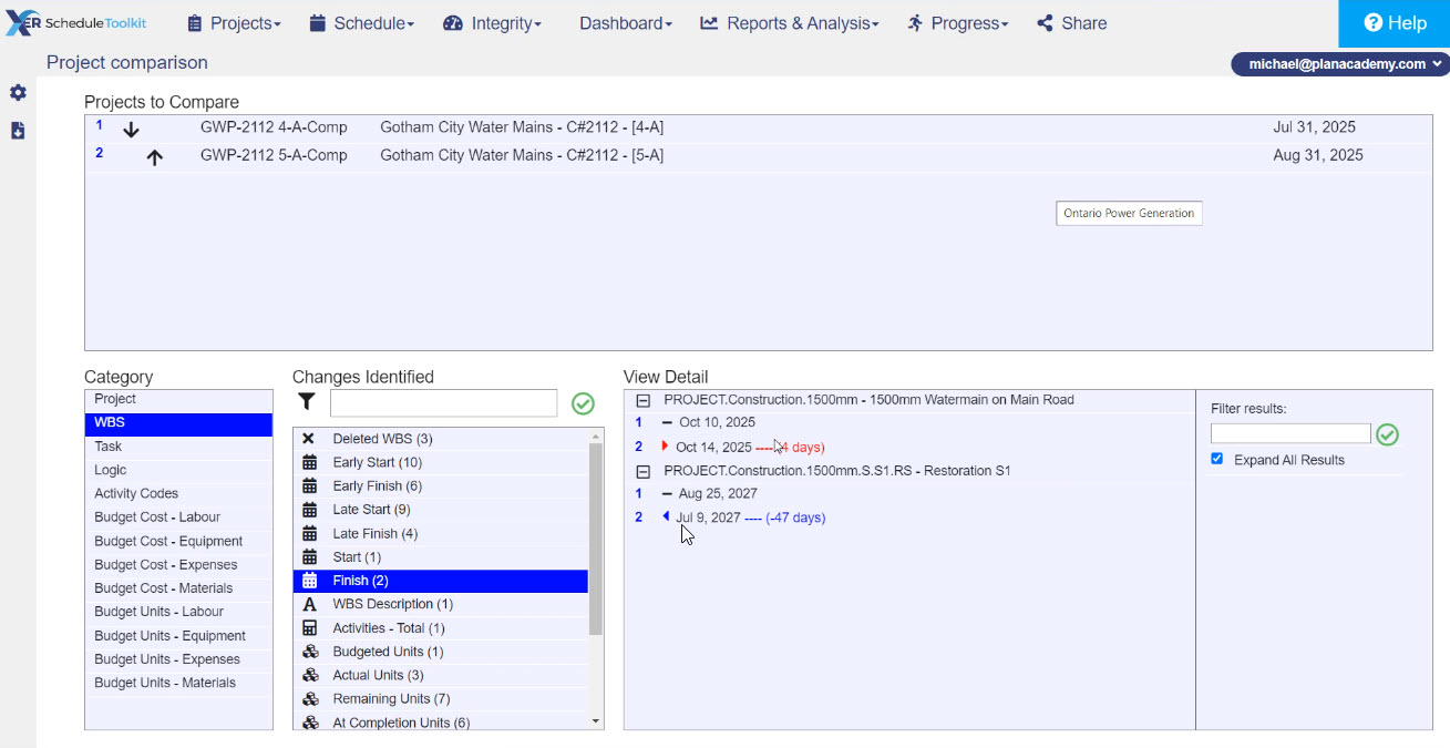
Not only that, you can also see some high-level things like total number of activities, whether that has changed, or the number of material assignments at the base level and whether that’s changed. You’ll see a few of these number type categories in this tool.
With XER Schedule Toolkit, we see number of Labor Assignments and number of Cost Assignments. So where are their differences? There’s a nice visual interface here and it allows me to dig in. Now, I can also send all of this to Excel.
XER Schedule Toolkit Exporting to Excel
First, let me say I like the Summary Tab on the Excel output. You can see all the different changes at the different levels. And the filters are already set up for you. So, let’s say I wanted to just filter on Logic changes. I can filter on logic changes and see the different things that it has identified.
Then, I can then use the tabs again. I love it when my results are broken up by tab so I can go down to the different tabs to dig in. And if we go to the Activity Tab, you can see all these different things I can filter in on the change in Finish Date, Free Float, latest number of Cost Assignments, etc.
There’s lots of different flexibility here to really dig in and I really like the filtering, I like the colors, I like how easy the tool’s output is to look at. Another thing that I really like is how some of the schedule comparison is broken out by Labor, Equipment, Expenses and Material. Budgeted Cost and Budget Units are broken up by these different areas, and you’ll see them on the spreadsheet as well.
On top of that, on the summary page you can see the actual crews and different labor crews. You can also see where there’s been change related to a crew, changes related to a material or non-Labor equipment.
Now, what did I struggle with? Once again, I didn’t see any Lag feature in this tool (but I was told it is in there and only shows when there are differences to report). I like all this breakout budgeted cost and budgeted units, but what about a progress schedule? I don’t have the same ability to track the actual costs or the remaining units.
Pros & Cons: XER Schedule Toolkit
PRO’s
- Provides a very detailed analysis
- Costs & Units are broken up by Resource Type and Resource
- WBS-level analysis
- Excellent Excel output
CON’s
- No comparison of Actuals at resource assignment level, only Budgeted values
- A Cloud-based Tool might not be secure enough for some users
COST RATING: $
Overall, I really like what XER Toolkit is bringing here in their schedule comparison features. The tool is easy to use and comprehensive with a great web-2.0 interface. The Excel-based output is excellent.
Tool #4: Deltek Acumen Fuse
Maybe you’ve heard about Deltek Acumen Fuse. It’s been around for a little while as well. Deltek Acumen Fuse is a tool that really is geared towards doing forensic analysis.
This is a tool that is really aimed at the professional user who needs to tease out all the intricate details and differences, as well as doing forensic analysis to aid in claims and other things. There’s a whole Risk side in this tool as well, but I’m just focusing on the Fuse side, which is the forensic analysis piece.
I’m going to share two areas where you can really see some professional-level analysis that we’re able to do in Acumen Fuse.
It’s going to start on the Diagnostics screen, and I can run all sorts of different diagnostics on projects. One of the things I like about this screen is what they call the Phase Analyzer. It divides the project into three phases or three years on the timeline, and I can see exactly where problem activities are located.
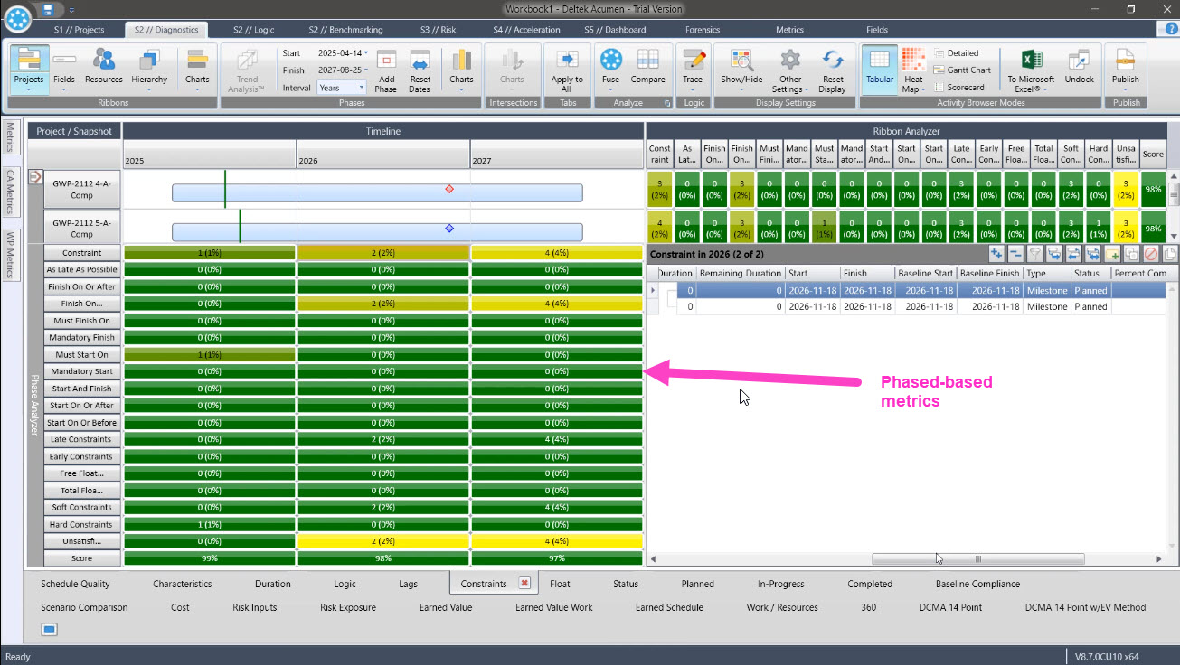
I’m able to do all sorts of analysis for Lags, Logic, Duration, Float, etc. I’m not going to spend too much time on all of them, but that gives you a flavor for the kind of phase type of analysis that is unique to Acumen Fuse from the other tools.
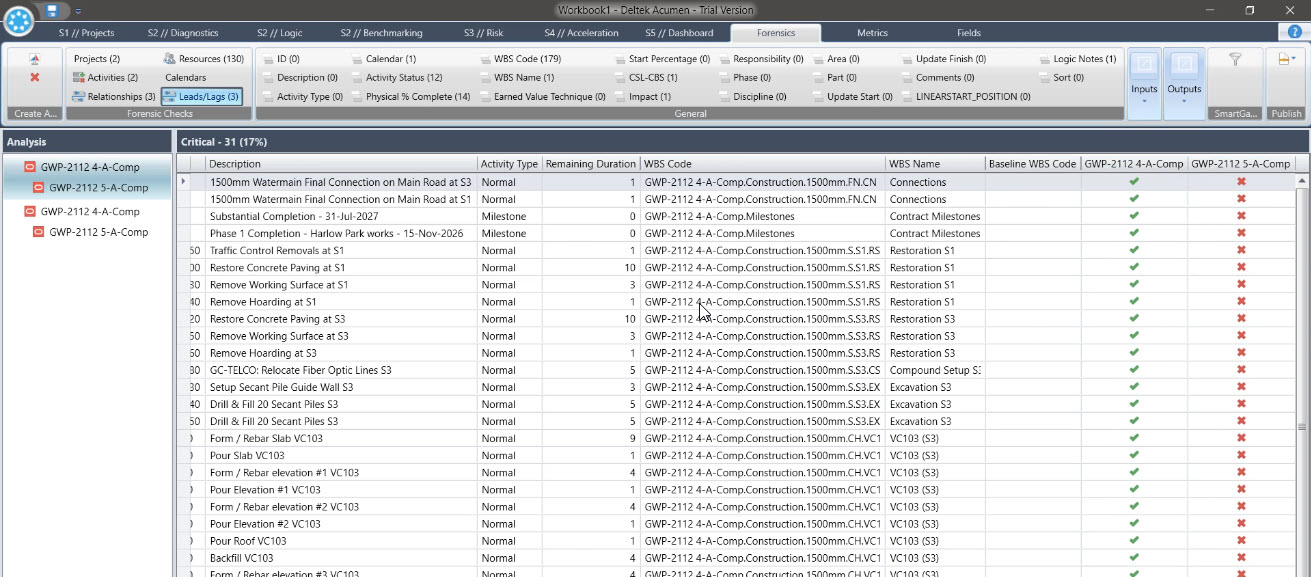
The Forensics area is where you can run detailed forensic comparisons like we’ve been doing with the other tools, compare two schedules to see the differences. We can do all sorts of analysis in this Forensics area on a field by field basis..
In the critical analysis as well, we can see which activities were on the Critical Path of one project and which were moved off. It’s very simple and straightforward analysis that we can do in Acumen Fuse. Support for costs is in here as well, but we also can export all this and publish it to Excel.
Deltek Acumen Fuse and Excel
A lot of the Deltek Acumen Fuse Excel output looks just like what we saw in the tool. We still have our icons and our visual reminders, and sometimes things are expanded a little bit more. With all the different tabs that Acumen Fuse exported there’s just a ridiculous amount of analysis that it does!
And again, we’ve got a filtering that we can do here. We can filter on our different Resources, and we can see the differences up or down. Now, these are units that we’re reporting, and the one thing I struggled with a little bit was finding the costs at the Resource Assignment level. I did not see good support for that. So that’s a little bit of critique there but really there is an incredible amount of analysis that we can do, and the Excel output is very well done as well.
Pros and Cons: Deltek Acumen Fuse
So how does Deltek Acumen Fuse compare to other tools? Well, here are things that I really like, and some of the challenges as well.
PRO’s
- Professional Level Analysis
- Differences by Time Phase
- Visual indicators for easy analysis
- Compare calculated project metrics, not just project fields
CON’s
- Acumen is complex and might take time to learn
- Default is too much data, need to pare it down to specific interests
COST RATING: $$$
Remember that Deltek Acumen Fuse is more geared to an enterprise kind of professional user. But the price isn’t so far out of reach for such a powerful tool. Acumen is priced by module, so you can purchase just the Fuse module if need be.
We can help. Contact Us.
Other Tools That Deserve a Mention
In the course of putting the video and this article together, a few other tools were recommended to us, but didn’t make into our reviews. They are worth mentioning and I recommend you check-out these tools as well.
- Schedule Analyzer by Ron Winters – I had Ron’s tool slotted to be included, but some technical hiccups prevented us from including it in the video and analysis. Thanks to Ron for providing us a trial copy regardless.
- Nodes & Links – Nodes & Links is a very cool up and coming cloud-based project analysis tool that provides AI-based recommendations on improving your project, as well as other insights. Had a demo recently and I was really impressed. N&L also has a very comprehensive schedule comparison module.
- Zümmer is another tool that does CPM analysis and comparison you might want to dig into.
- Schedule Validator also provide analytics, dashboards, validation and schedule comparison.
- Project Controls Online is a cloud-based tool that also offers schedule comparison.
Conclusion
Do you have feedback on our analysis? Do you want to see more content like this? Let me know in the comments below.